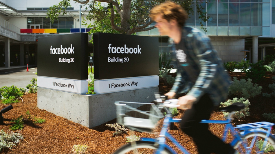
Facebook just changed its logo so slightly, you probably didn’t even notice

You know what’s really cool? A slightly rounder lowercase “a.”
Facebook quietly began updating its logo across its various properties this week, but the tweaks are so minor that many users likely did not notice. The new logo still combines the classic Facebook blue background with white lowercase lettering. The difference: Now the font is a little thinner and the “a” got a face lift.
For those font buffs trying to keep track: the old Facebook logo used the Klavika typeface; the new logo is a “custom typeface,” according to the company.
See also: 40 Hidden Messages in Famous Brand Logos
“Now that we are established, we set out to modernize the logo to make it feel more friendly and approachable,” Josh Higgins, Facebook’s creative director, said in a statement provided to Mashable. “While we explored many directions, ultimately we decided that we only needed an update, and not a full redesign.”
Sure, Facebook may access to an unprecedented amount of your personal information which it can use to target advertising to you with creepy accuracy — but hey, that new font sure does look friendlier.
Say hello to the new Facebook logo pic.twitter.com/ofoFm4JQmK
— Christophe Tauziet (@ChrisTauziet) June 30, 2015
The original iconic Facebook logo was designed in 2005, one year after the social network launched at Harvard and began its rapid takeover of college campuses and eventually the world.

Still can’t quite spot the difference? This might help:
New Logo for Facebook done In-house with Eric Olson. http://t.co/7s36a5ulR8 pic.twitter.com/ykoOOwd8co
— Sven Grothe (@svengrothe) July 1, 2015
Facebook made a similarly subtle change to its “F” icon in 2013, removing a faint blue line that had run at the bottom of the logo. When you’re Facebook, even the slightest changes have a way of capturing the Internet’s attention.
Have something to add to this story? Share it in the comments.

